This blog post if the second one where I will look over components you must have in your landing pages. You can see here my first post about the main headline. Theses points have already been tested by many companies in the world. They are also backed by serious neuroscience studies. Today, let’s continue with the Call to Action.
Description : How to create a good call to action
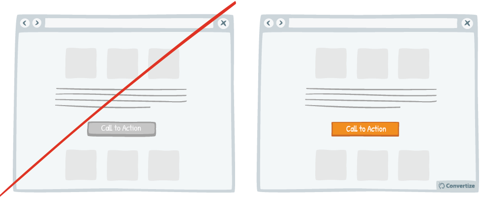
Call to actions are a must have on every page. These are buttons, banners, that will push the user to do an action. They need to be visible and to stand out from the rest of the page.
About wording, call to actions need to contain actions verbs such as download, discover, see… They can also contain words, used to reduce a pain, Free, fast…
To stand ou from the content, call to actions should be in a different color as the rest of the page. A study tested a lot of colors. The most converting colors are orange and green. Green is the color of hope, health, peace…
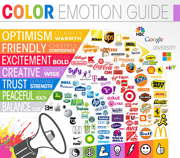
Emotions raised by different colors
This attraction effect by different visual elements has been brought scientifically. It’s in 1933 that Hedwig Von Restorff, German psychiatrist, demonstrates that an object different from the rest is more likely to be remembered. This effect is the base of why you should use a different color for your buttons.
Another good thing to do about your call to actions, is to link them with an emergency effect. We’ve all already visited a website offering the last bedroom, the last 3 seats in a plane… This effect plays on humans loss aversion. We, humans, are more sensitive to the perspective of losing, as the one of wining. The negative emotion you feel when you lose is twice stronger as the pleasure you get when you win. Playing on this effet will augment your chances of selling your product to the visitor.
You should as well make sure that your call to actions will be displayed in a clear and spaced place. Isolating theses buttons in a strategic way will reduce confusion on your visitor and augment its conversion rate.
To finish, ideally, you should keep your number of different actions as low as possible. Maximum 2 per pages. If you wish your visitors to register on your website, make sure this action is not lost into tons of different actions. Indeed, if you have a sign-up button, a newsletter form, a contact one… your visitor will be lost and you won’t convert them.
Exemple of Successful Use
Here I will offer you a set of successful business using this advice !
Hubspot
How to talk good practice with landing pages without mentionning Hubspot ?
Hubspot’s Home page is made with 3 major colors : light blue, white and orange. The first two are used for content and background. They kept orange, the most visible of the 3, for call t actions.
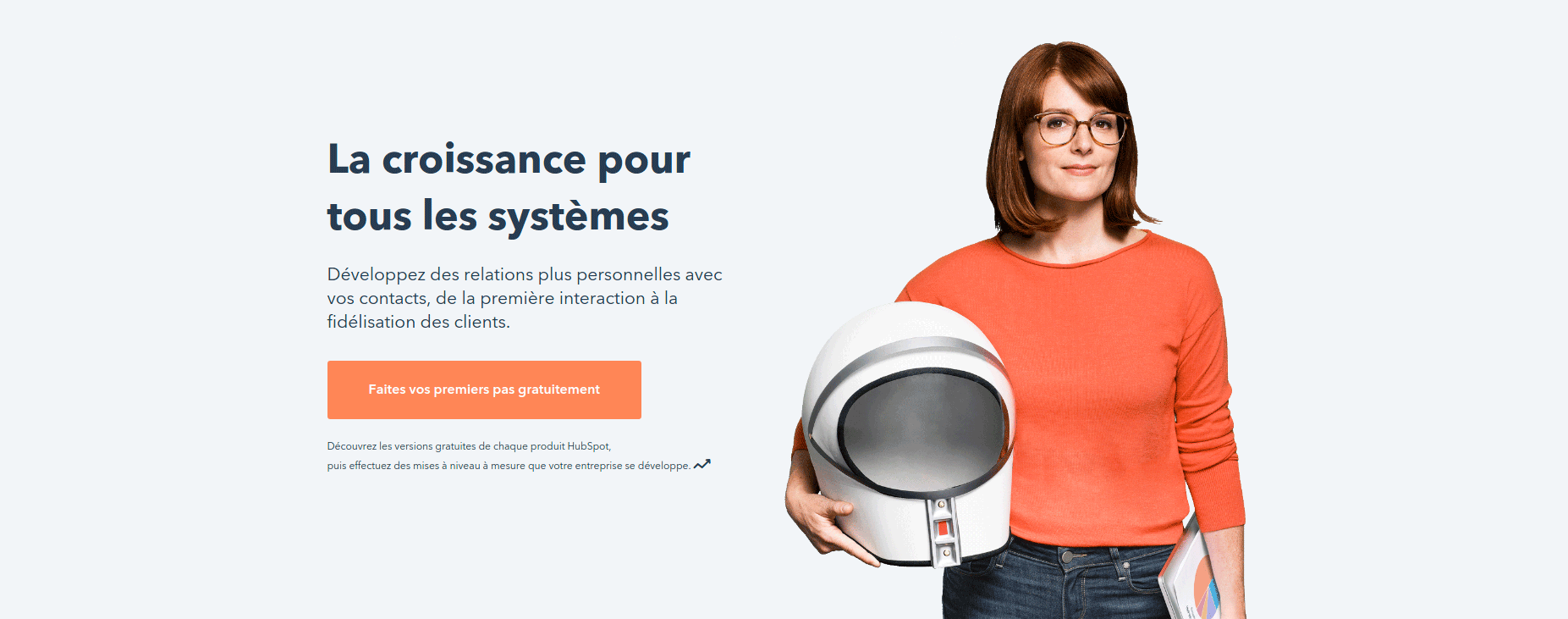
The page contains 7 call to actions. All spaced and visible on the page. Even tho there is a lot of them, they redirect the user to only 2 main actions. The first one is about registering the user. The second one is presenting every feature Hubspot is offering.
Payfit
On their side, Payfit are using 2 major colors for call to actions : Blue and green. However, on 4 buttons, most of them are red. This color is used because it’s the most visible, as they use white and blue backgrounds.

A bad point I noticed on their landing page, Payfit didn’t keep its colors consistent. First of all, they display the regiter button in green. There Ask a demo button is blue. In the bottom of the page, they use the green color for the demo button. This change in feature can bring some confusion to the end user.
On this page, Payfit also choose to put a lot of space around its buttons so they can stand out from the final content.
To learn more about Payfit’s landing page, feel free to read my full review.
The difference in font size is enough so the user will focus on the main title. Using the word new fill captive the user’s interest, what’s new is probably great.
This article is part of my newsletter and my future white paper about landing page study. If you’re willing to get it before anyone else, feel free to give me your e-mail address.