This is the first blog post of a list where I will ty to autopsy different landing pages from top companies. I wil see which persuasions techniques they are using, UX design tricks, wording…
In this first episode, I will have a look of the french version of a growing start up : Payfit.
Presentation of the company : Payfit
Payfit is a french start up, willing to revolutionize employees payment, expense reports, holiday management. They wish to automate all theses functions so that their clients can focus of other task with a real added value.
They raised 14 Millions euros in 2017, growing a lot, they are now going out of France to target the European market.
Their message is targeted towards HR and CFO. They want to reach small and medium size companies, growing companies that need to structure.
Globale Study
The page contains 3 major colour. Blue and white which are the company’s main colours. They compose the background. And a green, used to focus on some elements such as Call To Action.
They offer a live chat to their customers who are willing to speak to support or commercial departments. This chat based on Drift, allow them to reach directly the visitors and increase their conversion rate.
The page is cut in 9 different parts.
How is it build ?
Menu
The page starts with the top menu of the website.

Classic, this menu is cut in a symmetric way. The logo used as the axis. It contains 7 links with a green call to action for registering.
It is mixed with the next block, using a transparent background allowing it to merge with the next part.
To finish, this menu is fixed on the top. It disappear with scrolling. This behaviour is normal as only informative pages are reachable through it. The user needs to focus on the Landing Page content.
Value proposition
From the beginning of the page lay the value proposition of the company : « Paying its employees has never been easier (Payez ses employés n’a jamais été aussi simple )

In white, with a strong contrast with the dark background, centred with a 38 font size, this proposal is made to catch the visitor’s eye. No superfluous text neither explanations, here Payfit goes to it’s goal. They are willing to show the simplicity of the software.
Under this value proposition, it’s interesting to see that they offer 2 Call To Actions. They allow to either test the solution or offer a free demo.
Both CTA uses strong colours, blue and green. The Register button goes with the green in the menu.
Presensation of customers
This part is the last one above the average fold. Payfit chose to put an authority argument : Their solution works, 892 Companies are already using it !

Here, Payfit uses the 892 number instead of 900 to give more credibility to the number. The logos is a list of known companies in the French start-up ecosystem. (Heetch, Maddyness, Station F…) This logos allow Payfit’s targets to identify themselves as customers.
Moreover, using theses logos is a social proof. If that much companies are using it, the solution must be good.
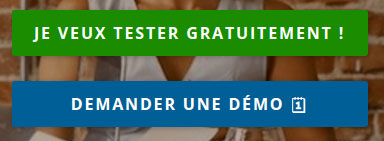
Features & Services offered
This part is accessible only after scroll. It contains a list of all the features making Payfit an amazing tool.
At first, they put their value proposition Payfit automates your employees’ pay ( Payfit automatise la paye de vos employés. Here, they offer to their future customers a way to stop losing time on meaningless tasks, and to focus on what’s important.
Under this title, there is a screen-shot of the solution. With this visual, users can start picturing themselves using this solution.
Under the screen-shot of the dashboard, they use 6 points they are working on. They don’t focus on features, but pains they are resolving. (Social Declarations, Pay…)
Every point contains an icon, the pain and only after Payfit’s solution to solve it.
Here as well, the language of simplicity and words to reassure the customer. The words Serenely ( Sereinement ), Best experience (Meilleure expéience), Finished (Terminé !) or Always here for you (Toujours là pour vous) will reassure the end customer. The word Automatically (Automatiquement) as well Payfit takes care of everything (Payfit s’occupe de tout) accentuates the implicitly, are both repeated twice.
Testimonials
This part is the only one with a blue background.
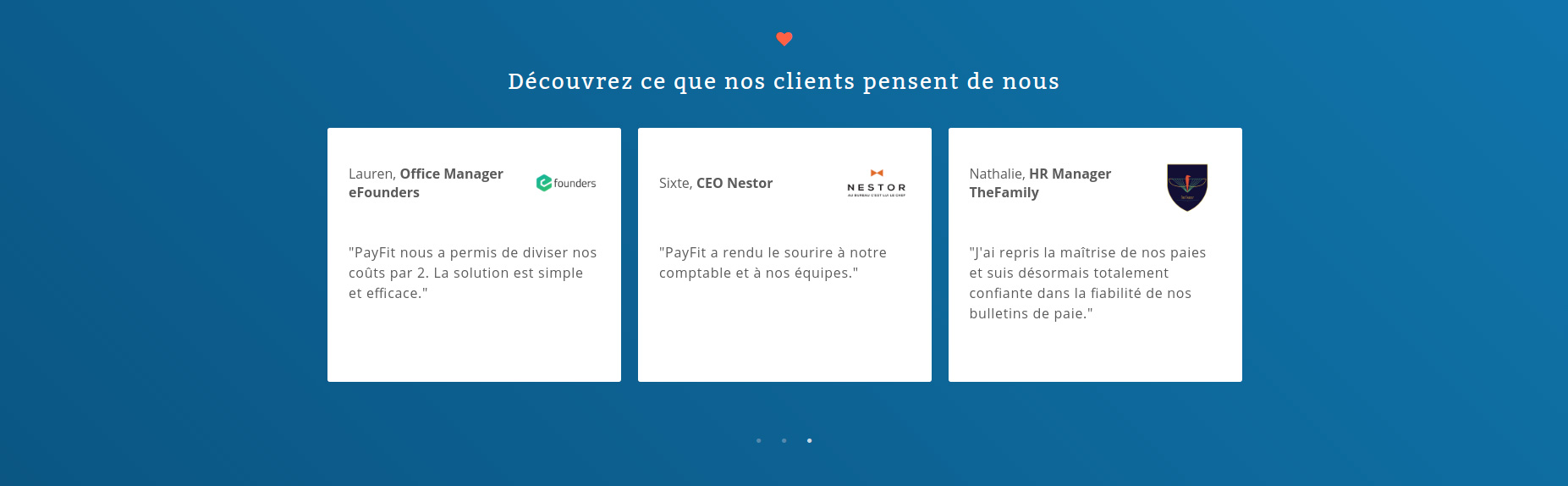
It contains customers’ testimonials and quotes. They are going with the logos in the customers section above. They bring humanity in what Payfit will bring to your company
Case Study
In this section, there are 4 testimonials video. Between Business case and testimonials, with a professional realization, they bring a lot of credibility to the company.
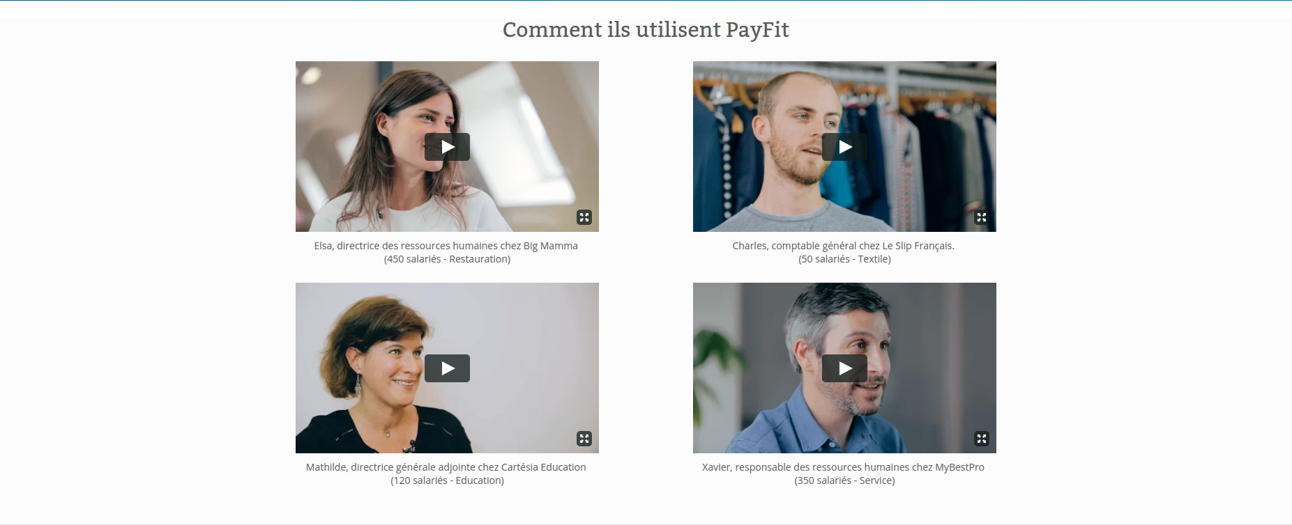
As humans, seeing real people and faces reassure. (This is why we see alot of faces in th nature, such as on cars, cloud, houses…) Theses testimonials are made to reassure tht the company is real and does a good job ; they also show that the listing of logos is not fake.. It’s a big bonus for Payfit’s communication nd a way to increase their credibility toward future clients.
Tarifs & Calculator
Everything is included (Tout est compris). Here is the most important sentence of this part. The price will grow as the company grows. Payfit is fully transparent with their price calculator.
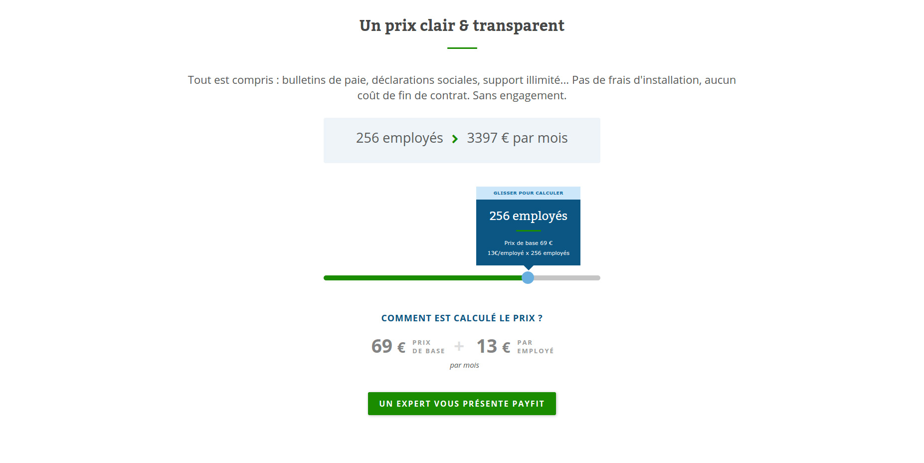
In this part, there is a gamification about the prices, with the possibility to calculate in real time the full solution price.
Furthermore, they are using the anchor effect, cognitive bias. This effect is so that the human brain will compare everything with the first number they will come across.
Payfit is targeting Medium companies (around 50 employees). The first price they display is 3,397€, for 256 employees. As the customer will change its number f employes, they will see a smaller amount. (For example : 719€ for 50 employees). He will unconsciously compare this price with the first one, seeing it cheaper.
Moreover, as a transparency policy, they display under the calculator how is this price created. With this, it allows the customer to see that there is no hidden costs.
To finish, there is a green CTA, centred offering a demo of the platform.
Press logos
Another part before the footer display a lgo of different influent french medias.

Theses logos are used to work on the company credibility.
Footer
The last section of the page is minimalistic. On a black background with a green line.

This footer contains some useful links such as social medias and a way to change the languages.
Speed and accessibility
Abut the speed, Payfit could improve a lot the reactivity.
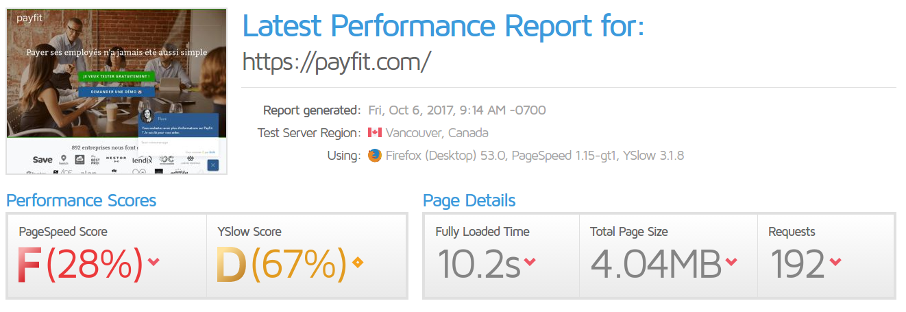
With a F on GtMetrix, Payfit’ website is around 4MB and takes more than 10 seconds to load fully. With a work on the images, cache and compression, they could easily divide by 2 their loading time. This loading time will result in a better conversion rate.
To speed-up your website, feel free to check theses 22 interesting tips!
Mobile device navigation is fluid and the website is fully accessible in the different mobile devices.
Conclusion
Payfit is a new company. They focus on reducing the pain of handling every administrative tasks. Trying to find credibility toward the market, it is the reason why almost half of the part of this landing page are made toward reassuring of the final customer.
Simplicity and automation as the key words, they are put in so the visitor will see the solution as easy, fast and efficient.
This article is part f my newsletter and my future white paper about landing page study. If you’re willing to get it before anyone else, feel free to give me your e-mail address.
If you’re looking for an audit to your landing pages, how to do them, to make them faster and improve your conversion rate, you can contact me directly here :