This blog post if the first one where I will look over components you must have in your landing pages. Theses points have already been tested by many companies in the world. They are also backed by serious neuroscience studies. Today, let’s start by the begining : The main headline.
Description : What is the main headline ?
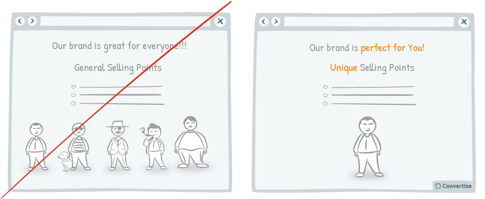
A visitor on a website take less than 3 seconds to choose whither he will remain on it or leave. You need to catch their attention in this short period of time. To achieve this, go straight to the point and be concise. Tell to your visitors what they will find in your website.
Online users, most of them don’t read texts. They focus on graphics and titles. Organize your page so they will get what you offer, in your main title, fast and clearly. This need to be available in the beginning of the page.
In this title, put your unique value proposition. Ideally, your visitors should be able to define your company just by reading theses few words.
This sentence should be directed toward your customers. Pelham, Carvallo & Jones published in 2003, a book talking about social cognition. People tend to prefer a company or a product which they can relay to. A company they have something in common. Having your value proposition toward them, allow them to feel implied and augment your chances of selling.
Another tip to look into is : Put emotions in your title. Using words related to well beeing, novelty… Theses words will catch your customer’s attention. This neuroscience principle, Attention biais, has been studied in 1996 by Mogg and Bradley in their book A cognitive-motivational analysis of anxiety, Behaviour Research and Therapy. Our attention is modified according to our emotional state.
Exemple of Successful Use
Here I will offer you a set of successful business using this advice !
Payfit
In its landing Page, Payfit display a lonely main healine. It is cented on top of the page.

Main Headline presenting Payfit’s Value proposition
They talk directly to the consumer, using words such as “ vos employés” (your employees). Theses words will include the reader in the sold solution. They also use simplicity touching the reader’s emotion of an easy use.
To read more about Payfit’s landing page, feel free to read my full review.
Stripe
On their side, Stripe used a title followed by a bloc of text.
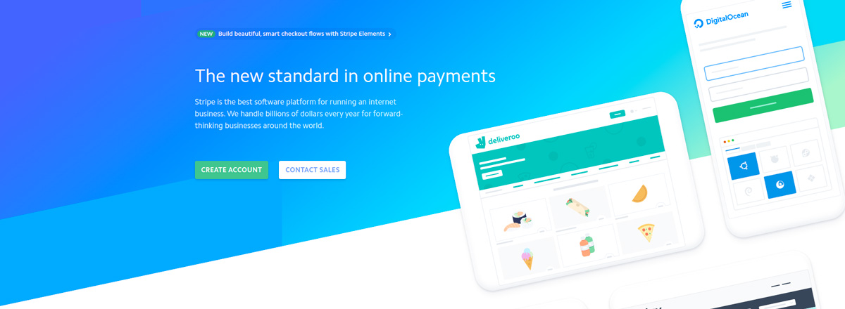
Main Headline presenting Stripe as the new Online payment standard
The difference in font size is enough so the user will focus on the main title. Using the word new fill captive the user’s interest, what’s new is probably great.
This article is part of my newsletter and my future white paper about landing page study. If you’re willing to get it before anyone else, feel free to give me your e-mail address.
If you’re looking for an audit to your landing pages, how to do them, to make them faster and improve your conversion rate, you can contact me directly here :